|
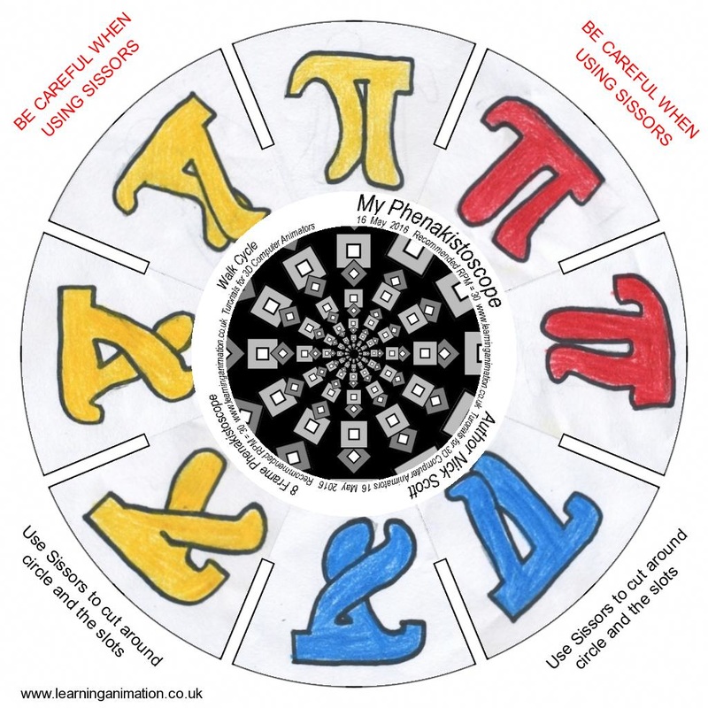
Phenakistoscope
It is a disc with images that are slightly different from each other so that when spun quickly, it shows the illusion of motion. Being that this is made for a constant loop, it is endless walking as a walk cycle. The thaumatrope is my favorite old school animation device due to its simplicity and how easy it is to make it. The phenakistoscope was difficult in the fact that all the pictures had to marginally similar or else they looked messed up. Game Unit: The Factory
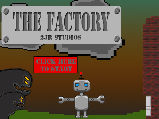
The process of making the game was frustrating with all the graphics and the use of gif files. The best part of it was when we found a bug and managed to fix it, but when we fixed it, it seemed like there was another one to replace the previous one. If I had more time, i would have scrapped the idea. My idea was to have a game where it was the same level, but more obstacles would be placed every time you completed the previous level. Color Theory Project
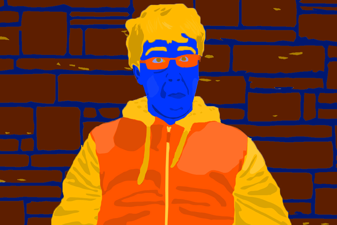
This is my color theory project using a split complementary theory of blue, yellow-orange, and red-orange. The background, in my opinion, is there for a simple, but unique design. The expression is not completely there as from the original picture, but it is close enough that it works for me. The shades and tints really made it different giving it a good expression and feel to the face and jacket. Last but not least, the element primarily used in this is most likely, if not certainly, color. Photography Project
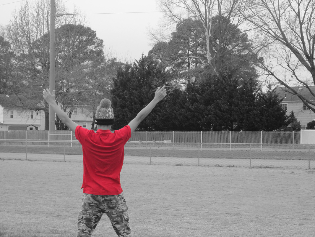
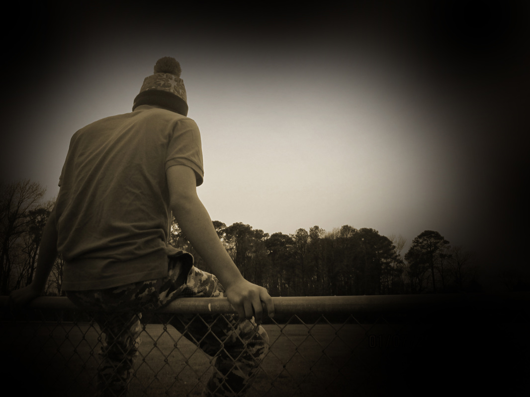
This project was not as stressful as I thought it was going to be. The two photos here are an emphasis on top, and a sepia, which turned into a vignette after the time stamp was on the photo. These photos are my favorites of the 9 I took. The element used in the emphasis photo was color due to the bright red of the shirt. However, in the vignette, the element was probably space due to the way a vignette looks. Overall, all of the photos taken are my favorite parts of this project, mainly editing them to look and feel special in their own way as a photograph. Critter Montage!
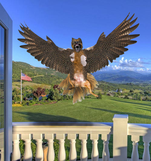
This is my Dog and Falcon combo. It is comprised of three different dogs mixed together like a frankenstein and the falcon wings. The most useful tool was the clone tool to get most of the body shape. The element and principle that are strongest in this are probably unity and color, at least to me they are. This was pretty frustrating for me since I had to frankenstein the body with three different dogs. Then had to blend that in to make it look right. Tesselation
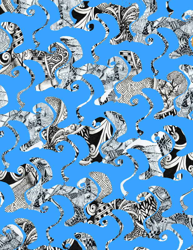
The strongest thing here is probably emphasis since the zentangles are very contrasting to the blue. It is easier to do a tesselation on the computer since you can just copy and paste each row and make it in a matter of minutes. But the thing that made it difficult for me was the zentangles and trying to get it to look right. Font Bot Project
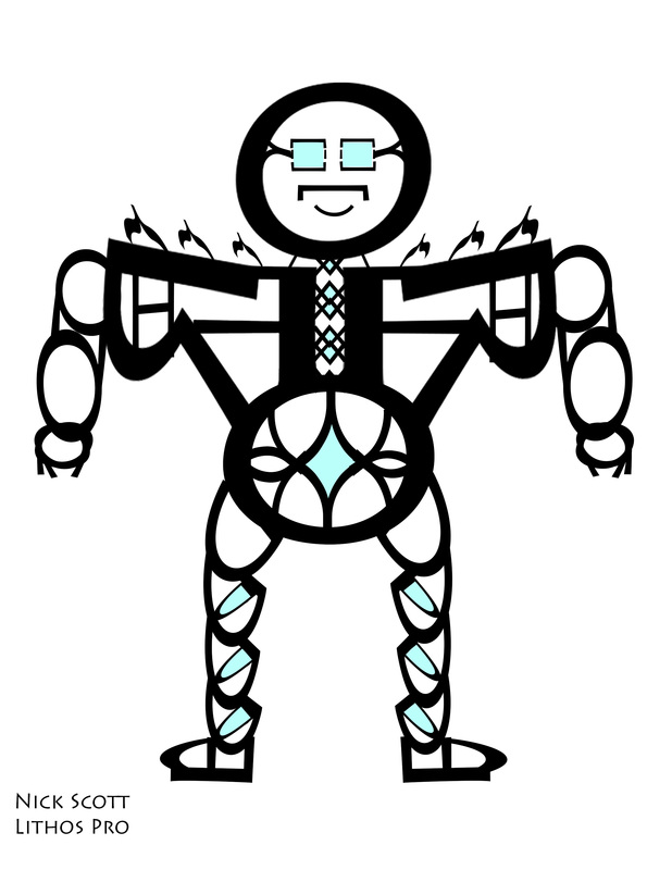
This is my font bot, and it is made out of the type font Lithos pro. It is Sans and I feel that it matches the font by making a smooth, and clean bot. The process was pretty easy and I liked using PS for this project. Its backstory is similar to the movie Pacific Rim in where it is a gigantic robot to fight monsters. It was supposed to look like a potbellied guy turned into a robot, but I don't think it turned out that way. But it still looks good. Square 1 Project
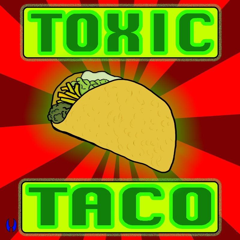
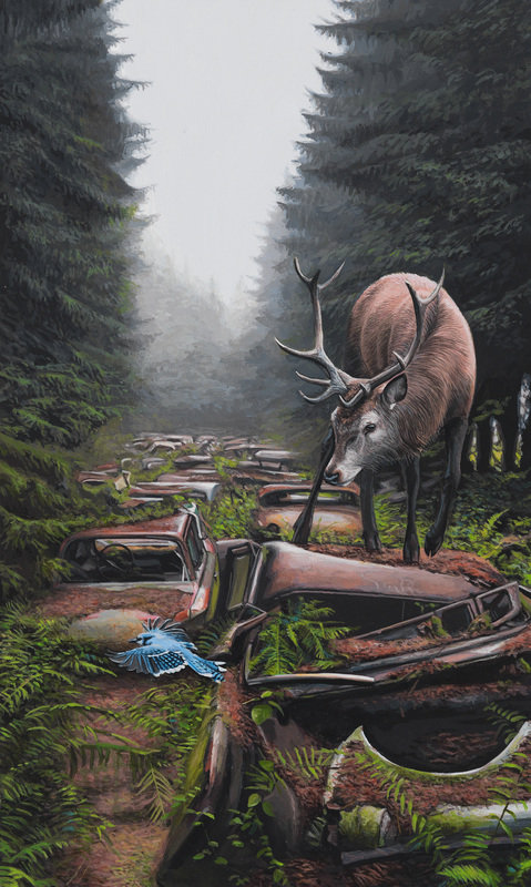
What I did for this project is a taco with green radiating from it on a red pinstripe background. The taco contrasts nicely from the red, so it really pops. I really liked using the tablet on this project, since it made it a lot easier. I think I used both high contrast and value, but I think I used value more for the taco. This is a piece by Josh Keyes called, "Red Road". Here, it shows a highway in a post-apocalyptic scenario where the cars have rusted over and there is overgrowth all over them. And the trees have grown in places that would normally be grass. Also, the animals have completely overrun the area, shown here as a deer walking over the rusty cars. Here is the link to the picture: Red Road
|
